Just a note to let you know that I’ve been posting on Instagram, which is more compatible with my decreased blogging time due to work, (although I see WordPress has caught up rather, which is all good).
Anyway, if you’d like to see what I’ve been up to over the last couple of years, please do take a look at @rebeccayoungnicholson . It would be so nice to meet you there.
Here’s a taster of recent explorations…maybe see you soon?
I’m not sure what happened with this picture – it was supposed to be quite free and fairly large scale, but it turned into a mediocre ink painting. With nothing to lose, I decided to have a play on top with some bigger outlines using a very fine nibbed dip pen, but this was my first try on watercolour paper, and being a leftie it turned out quite scratchy. Never mind. It’s just an experiment, after all.
I normally think of myself as pretty calm, and suspect this comes through in my art. So what was going on the day I produced this doodle?
It began with the last page in a sketchbook whose paper I’d never really taken to. Finishing it would be a relief. I laid down a set of lines in Indian ink, drawn with a feather dip pen made on the spot. I applied blue ink, then drops of red, which I blew into spindly shapes. It began to have hints of landscape about it, reminding me of the walk up Mam Tor in Yorkshire. I encouraged this tendency with mark-making, a bit of silver acrylic, some white gel pen, a smidge of blue fineliner – even a bit of finger painting got involved. It was a real no-holds-barred experience. Sometimes these things just happen.
And suddenly, a title suggested itself: And Man Walked; and Farmed; and Fought.
So, I was on a roll with my waterfalls. I decided a third would make a satisfying triptych, and having not done much watercolour recently, decided I should have a go. It was more straightforward than I’d expected really, once I’d found the stinky old masking fluid and decided that it would just about do for my needs.
My focus was to try very hard to put in the full range of tones – I always struggle with getting really good darks into my watercolours, partly because I’m often too impatient to wait until everything dries and add to sections for good depths. This time I was conscious of that need, and worked at it; I think it paid off in the third image below.
Acrylic
Fineliner
Watercolour
Now I just need to find some wall space to hang them…
Taking the previous waterfall experiment as a starting point, I then thought it would be entertaining to take it further into a small series. In truth, I thought a drawing of the scene would complement the more abstracted version of the waterfall, and help it to ‘make sense’.
I do really enjoy drawing in fineliner, and it was quite a meditative process to convert the image to monochrome, although I’ll admit I’d forgotten how long just drawing something can take when you’re really concentrating on the detail.
It was satisfying to use the humble brown paper to draw on, and the white gel highlighter added at the end really helped the image spring to life.
I’m pleased with the graphic feel of this one – not so much my usual style, but I think it works for the drama and starkness of the subject.
A few years ago my sketching friend and I went to a workshop at Leeds School of Art. The focus was to study the work of David Tress and take inspiration from his work into our own art. In retrospect I really gained a lot from the session, moving away from detail and towards elements of abstraction.
With time on my hands I thought I could revisit what I’d learned, so I picked up a small, narrow piece of mountboard and looked for a subject. I found a photo of a waterfall in Wales which appealed and suited the dimensions of the card. By collaging packing paper and newsprint I created a textured base on which to paint with acrylic. I went a bit mad with colour (I thought at the time) but was pretty happy with the result.
It’s rough and ready, but I think it looks at home mounted on some brown paper.
It’s nearing the end of the Easter break, and what with the ongoing Covid closures of interesting places, I’ve had time at home to sit and play.
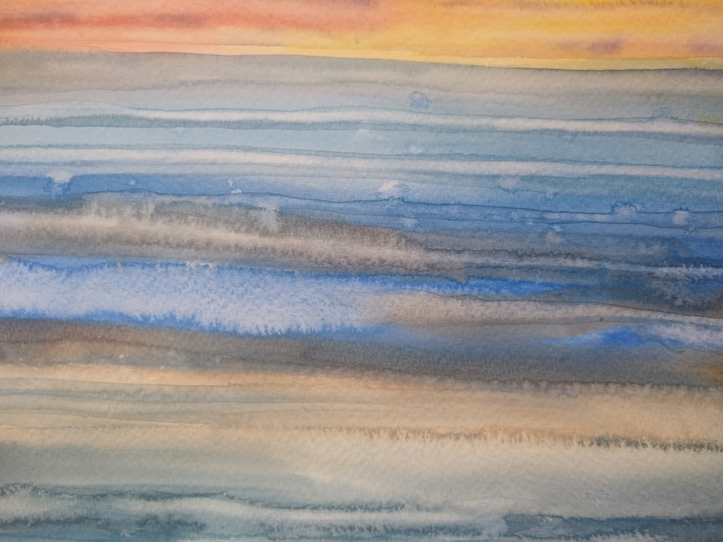
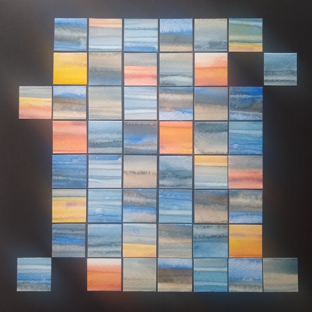
I was a bit lost for inspiration, so thought I’d get the watercolours out and splash some paint around. I usually find this entertaining, and can always find something to do with the results. This time, rather underwhelmed by the outcome, chopping the image up and reassembling it seemed like a good idea. Here’s the outcome, before and after.
You would not believe how long it took to arrange the squares in an order I found pleasing!
I like how each little square seems to contain a complete landscape, skyscape or seascape in itself.
At Christmas we were sent a box of shortbread. Although the shortbread was delicious, the box was even better – much too good to throw away. So it sat on my shelf, waiting. Finally, I knew what I wanted to do with it. A quick scavenge in the garden, a little blue ink, a touch of gold paint and gold leaf and hey presto!
So, from left to right we have a sprig from a plant of which I don’t know the name, a sycamore leaf, a dove’s feather, a portion of monkey puzzle tree and a skeleton holly leaf. All imperfect beauties salvaged for posterity. I just wish my handwriting was a bit more… perfect.
It’s been a looong while since I visited my WordPress site, but I’m going to try to remedy that. Lockdown life has been busier than one might expect, but thankfully there has been some time for reflection and art amidst the travails of working from home.
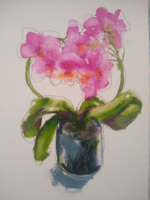
I was given this orchid about two years ago. It’s been a superstar, blooming almost continuously. I have danced around painting it for a long time, but didn’t have a clear idea of how to approach it. The abundance and complexity of the blooms deterred me.
Yesterday I finally went for it. I’ve been trying to think less literally about drawing; the intention was to put down a selective light colour ink wash and then draw over loosely, holding the pen at its very end to reduce control. As sometimes happens, things took a slightly different turn, and the inking became a bit more than just a wash (although not quite a painting) to the extent that I was reluctant to draw on top of it. However, I had a stern conversation with myself and stuck to the plan. I’m glad I did, because I think the pen lines really add some interest, and have salvaged the pot which was not at its best.
I’m actually really happy with how this turned out – playing was key. I need to remember that – it feels like an evolution.
14″x10″, Dr PH Martin’s inks, black UniPin, Pitt white marker, Staetler triplus coloured fineliners on Langton 425gsm watercolour paper