
So, you’ll be glad to hear that I’m almost at the end of talking about our Spanish trip…just a couple more posts and I’ll be done.
It was a beautiful photo taken at dusk which inspired me to paint this acrylic of the house where we stayed. The scene strongly reminded me of Magritte‘s Empire of Light scenes, where blue skies are the backdrop for extremely dark foregrounds, and the house lights shine out warmly into the night. I loved the expanse of dark foreground, and the bold contrasts in colour and shade. I knew I wanted to recreate this in paint, and after shying away from it for about a week I finally got stuck in with the acrylics yesterday.
The mental process is always so important – in what order does the paint need to added? For me, this really dictates what can and can’t be done; I’ve found that I like to paint with imperfectly blended colours on my brush, which means that strokes laid on can’t easily be corrected if I make a mistake later when painting the next ‘layer’. This does cause some head-scratching, finger crossing, and occasionally quiet cursing. But you know, it’s fun.
Here I began with a sheet of hardboard roughly 12×16 ins. I really didn’t want to go any smaller. This finished size caused some issues, as the camera wasn’t doing a good job on the colour reproduction, compounded by the shiny acrylic surface. Therefore I used my scanner, but only half the picture could fit at a time, which is why there’s a rather unsightly line down left of centre where I’ve inexpertly stitched two photos together! I’m happy to say that the real thing looks rather more convincing…
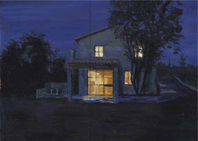
Anyway. After pencilling in the outlines, I laid in the purple-blue sky (there is a hint less red in it than shows in this scan), moving on to the main body colour of the house and the path surrounding it. That was a much harder colour to mix than I expected, mainly because I couldn’t decide what colour I was really looking for to convincingly portray yellow stone in deep purply night conditions. Tricky. Next I added a very dark green for the foreground grass and the background trees, with some even darker patches for extra density. The detail of the porch roof and the darks under the eaves and the side of the chimney followed. I went for it with the yellows to give the golden light spilling out from the windows. Then it was time to add in the tree at the front, and the window frame details. Standing back and looking at the painting from this point, I could see that the path still wasn’t dark enough, and I felt that the colour of the house was too flat, so I took further measures there to try to compensate. I used a 3/4 inch flat brush throughout, choosing to persist even for the fiddly areas, since I like the interesting, slightly unpredictable quality wrestling with it gives.
This picture represents two new challenges for me: to try an acrylic of a house and garden; and also to produce a painting with a ‘dusk’ feel. I like the darkness throughout, and I’m especially fond of the way the light shines from the partially obscured upstairs window. I know I learned a lot here, and I really enjoyed the process.

….what a success! Painting night has an immediate sense of mood for the viewer–instant mood–a feeling which other subject matter can’t match. this is great.
LikeLiked by 1 person
Oh Lance thank you, your comment means a lot. 🙂
LikeLike
You captured the light so gorgeous…amazing!
LikeLiked by 1 person
I’m really pleased you think so – thank you! 🙂
LikeLike
you certainly did manage to produce a painting with a “dusk” feel and you did it brilliantly.
LikeLiked by 1 person
This is so kind Carol – thank you! 🙂
LikeLike
Wow, Rebecca, what a stunning painting. Even though it’s night time, the lights in the house make it a very inviting painting. I want to knock on the door.
LikeLiked by 1 person
That’s such a lovely compliment, thank you very much Sharon! 🙂
LikeLiked by 1 person
🌺💕
LikeLike
Truly lovely, Rebecca. You’ve captured the light so beautifully.
LikeLiked by 1 person
That’s very generous of you to say Michael, thank you. I’m pleased you think so. 🙂
LikeLiked by 1 person
All of the above. Wonderful painting. (K)
LikeLiked by 1 person
Thank you for saying so, Kerfe! 🙂
LikeLiked by 1 person
Oh my gosh!! I thought this was a photo on my phone! The light is amazing!! This turned out beautifully Rebecca!! Impressive!! 😍😍
LikeLiked by 1 person
I’m really glad you think the light worked, as that’s what I was hoping for. Thank you very much, Charlie. 🙂
LikeLiked by 1 person
Wow! The light is so well done – the trees especially!
LikeLiked by 1 person
Thank you so much! I really enjoyed doing both of those areas… 🙂
LikeLike