
What do many musicians dislike most? It’s the daily drudgery of scales and arpeggios – until you’ve mastered them, that is, after which they just become something you do automatically, and which provide the building blocks for better playing. I know it’s the same with painting. But I freely confess that I’ve been shying away from some of the most important watercolour exercises. My excuses were that:
- I want to spend my limited time actually painting a picture, not doing un-creative practice
- It might be boring
- Nobody bothers with this stuff anyway
- Why would I waste my paint?
 All pretty weak reasons, I’ll admit. Yesterday I didn’t feel creative, but I had time to spare, for once. The obvious thing to do was make a colour chart for watercolours.
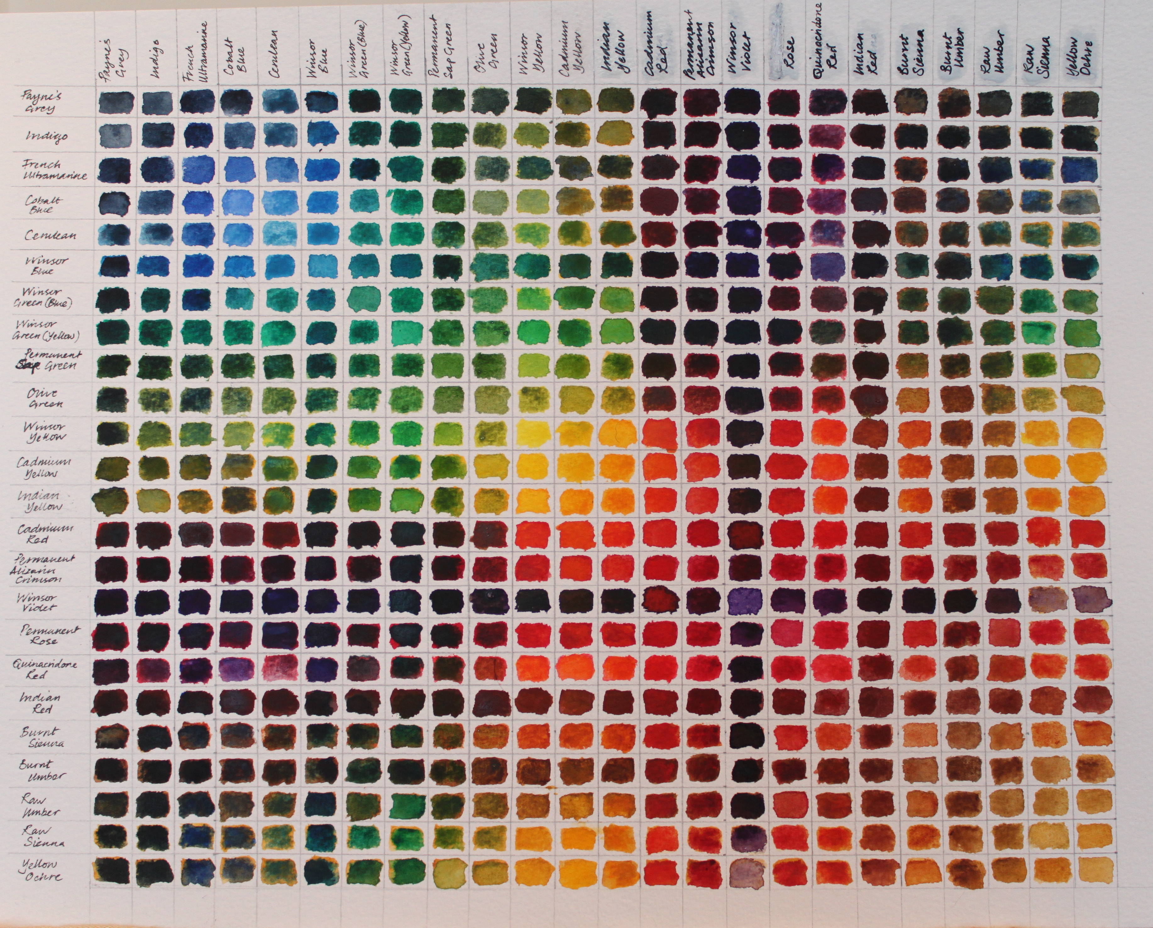
I counted my paint pans – 24, not including black and white (which I hardly ever use). I dug out my biggest watercolour paper and drew up 24 x 24 box grid. That’s so many boxes that each one measured only 11mm x 14mm. I was a bit worried that this might be too small, but in actual fact it worked fine. I reorganised my palette into colour groups – that was fun – and then labelled the axes with the paint names in the order that I intended to work through them. I subsequently discovered that I’d missed one out on one of the axes. This was very irritating, as I’d labelled them in pen, so I had to correct this in order for the chart to work properly.
And then I set to with the paint. It’s a methodical, slightly meditative process, requiring concentration. I’m sure I didn’t follow the recommended method, as I put my main colour on the paper and then added the next colour to it, mixing on the paper rather than in the palette. My excuse is that this might show me a range of colours that could be achieved in one square, as often I work this way in painting. I chose to repeat the colours on the grid to make it a full rectangle, reasoning that two shots at mixing each two colours together might be more representative than just one.
As I went along, I made some interesting observations:
- I discovered that there were a few colours which, if necessary, I could easily remove from my palette as the mixing results were very similar. I could drop Indigo if I kept Payne’s Grey (or vice versa) and the same goes for these pairs: Raw Sienna and Yellow Ochre; Winsor Green (blue) and Winsor Green (yellow); and Cadmium Yellow and Indian Yellow.
- I find that I love my new colour, Quinacridone Red, which I’d only just added to my paintbox. I think there’s a lot of potential there.
- The Siennas make some wonderful colours when combined with the blues. I’ll definitely be doing more of that.
- I really dislike Indian Red. It’s a bully of a colour and dominated every other I mixed it with. However, I think it might still have its uses, so I’m keeping it.
- Cerulean looks dreadful when it’s going on wet, but actually dries very nicely.
- I think I’ll try to make more use of violet for mixing very darks, there’s a lot of potential there.
All in all, this was a really very useful exercise which I hope will reduce the amount of ‘flying by the seat of my pants’ I do when painting. I’m glad I took the time to do it, and now my only worry is how I’m going to carry the chart with me when I paint, until I really know my colours!

I just love it as a grid (of course…)
I used to do that with my markers, when I was using them for my sweater design, but I never thought about doing it with paints. Maybe because I never painted that much. The chart was very useful when I needed a particular color…though of course I was working at a drawing table, not outside! (K.)
LikeLiked by 1 person
Aha, of course you’d enjoy seeing this! 🙂 I love the way it looks, quite satisfying all round.
LikeLiked by 1 person
I think you’ll find it invaluable. Kudos for taking the time to do it, and it’s great you’ve already learned so much from it!
LikeLiked by 1 person
Thanks Laura! I too think it will repay me over time. 🙂
LikeLiked by 1 person
Wonderful discoveries! Now you did the work and we can learn from it too – another “pro” for this exercise. You’re being ultra helpful, thanks!!
LikeLiked by 1 person
Hey, you’re absolutely welcome! 😉
LikeLike
I love this and it’s on my list of things to do too. I recently just took all my paint and created swatches from light to dark intensity so I could understand how the colors go down and how granular they are (or are not). It’s been so helpful. The chart is rather large but I do refer to it a lot when setting up a palette. It certainly helps me avoid disappointment. And like you, I had to isolate some of the nasty colors that I made a bad choice on. This will be a perfect exercise when I want to paint but nothing strikes my fancy.
LikeLiked by 1 person
Thank you! It’s vice versa for me – I had considered the light/dark chart, but haven’t ever done it yet. It’s good to hear you’ve found it useful, and will give me more impetus to make one myself!
LikeLike
A worthy undertaking Rebecca, thank you for sharing.
LikeLiked by 1 person
Totes welcome, as the youth of today say. 🙂
LikeLiked by 1 person
The grid looks like an out of focus image – interesting in its own right. You seem to have a lot of colours. I just use the three primaries ( a warm and cool version of each) and two siennas which I could probably do without as well as black and white for oils and acrylics. Having so few allows you to really understand your mixes and also if I want to repeat a colour for another painting – or touch up a scratch I can generally instantly make up the mix.
Another palette that people use is the subtractive palette ( my one above is the chromatic palette) where you have the three primaries and their secondary complementaries next to each. You can then move from one colour to the other via greys without needing to clean your brush in between.
LikeLiked by 2 people
🙂 That’s good advice, Graham – I really like the idea of being able to reliably find a colour later. I do have a lot of colours which came with the W&N paintbox. I’d be interested to hear which primaries you use. I’ve so much to learn!
LikeLiked by 1 person
Rebecca, my two reds are alizarin crimson and winsor red, cadmium yellow and winsor lemon, and ultra marine blue and winsor blue green shade. All are winsor and newton artist colours in my watercolours. To get lighter shades I obviously dilute but I dont use neutral tint to darken, which if you are following Munsell’s colour tree you might want. As I said I also use burnt sienna and raw sienna to quickly give me more interesting greens and greys, but in theory I shouldn’t need them.
LikeLiked by 1 person
Thank you very much for sharing this with me, Graham. It’s really interesting to hear how you manage your colours. Happily I have all these shades, except Winsor Red (I’ll have a look to see what I can substitute). When I’m feeling brave, I might have a go using the limited palette you suggest. I’m sure it would be good discipline and I’d learn a lot. 🙂
LikeLike
You just need an orange red, cadmium red is another. I think it is braver with a bigger palette as there are millions of permutations. What I did was to add a small amount of one of the colours to another, say a bit of alizarin to ultra marine. Then I add a bit more and a bit more, recording all the results until I get back to ultra marine. Then with theses secondaries you can add the complementary and run a series of tertiaries in a similar way. There are an awful lot of colours you can get and that is with just six starters.
I suppose having some secondaries in your palette gives you some brighter colours (handy for floral work) than you would if you mixed them as mixing paints produces duller results than the two parent colours. This is in contrast to mixing coloured light which gives a brighter mix than the parent colours.
Though in the end the more you have the more complex it becomes.
Some painters, like Alvaro Castagnet or Joe Dowden keep a few highlight colours for showboating, but work from a restricted palette.
No, I think a big palette is far braver.
LikeLiked by 2 people
Thanks so much for taking the time to write this, Graham. Your observation about the dullness of some of the colours struck me particularly – I had noticed this but hadn’t really thought about why this was happening. So thank you for the explanation there. I think I definitely need to do more experimentation to gain a deeper level of understanding of colour, and probably should look more carefully at the palettes others choose too. I’m off to take a look at the work of the painters you mention… thank you again. 🙂
LikeLike
Wow Rebecca, looks like your time really paid off. Not to mention the things you learned in the process and the time saved in the future. Great idea too!!
I always keep simple color charts of my markers or watercolors but I have never made a mixing chart. Now I’m wondering how I’ve gone without one for so long.
Oh, and the chart looks like a work of pixel art in and of itself.
LikeLiked by 1 person
Heehee, I look forward to seeing a chart from you in due course then! I was very surprised by how attractive the chart actually turned out to be. I’m pretty sure it’s going to be very useful. 🙂
LikeLiked by 1 person
Wow, this is and looks amazing!!! I first thought: Ugh, what a boring thing to do. But then I read what you learned from it and now I think: I gotta do that too as soon as possible!!! Thanks for this lesson, Rebecca!!! 😊🎨
LikeLiked by 1 person
You’re so welcome – it was a revelation for me, so I hope you have fun doing it. I look forward to seeing how you get on… 🙂
LikeLiked by 1 person
I love it. Knowing your colors/pigments is so important. You’re going to love the Quinacridones, by the way.
LikeLiked by 1 person
Thank you! So, I’m going to have to investigate further into the Quinacridones? That’s something to look forward to… 🙂
LikeLike
You’ll be fascinated by the burnt orange and Quinacridone gold is so beautiful …
LikeLiked by 1 person
Great idea, I’m going to have to do this!
Sorry btw for the billion notifications from me. It appears WP hasn’t been showing these in my feed. I was wondering of you were still creating, so I went to your nlog directly. Glad you are creating!!
LikeLiked by 1 person
Hahaha, I was wondering why the splurge! (but thanks!). I think I’m missing some characters from my feed too, as some old regulars don’t seem to be there any more. You’ve prompted me to investigate… 😉 Enjoy the process of the colour chart; it’s a bit more fun than it looks!
LikeLiked by 1 person
I used to be suggested this blog by means of my cousin. I am not positive whether
this publish is written by means of him as nobody else realize such detailed approximately my difficulty.
You’re amazing! Thanks!
LikeLiked by 1 person
Thank you very much – I’m glad you liked it and hope you find it useful.
LikeLike
Indian red is very strong. It’s usually a variety of mars red (synthetic red ochre) which as far as I know it’s the second most opaque pigment, with only genuine vermilion (the kind made from mercury, almost never used in watercolor anymore) having a higher refractive index. It may vary a bit depending on the exact variety of mars red pigment and how the paint is formulated. Lately I’ve been trying to practice portraiture in oils and I’m finding Indian red to be pretty good in a flesh tone mix, not that I have much experience yet, just as long as only a tiny amount is used. 🙂
LikeLiked by 1 person
Sorry for the long delay in responding – Christmas is always hectic. Your thoughts on Indian red are really interesting to hear. I haven’t tried using it in portraits, but I can imagine that a little would go a long way… 😉
LikeLike
Pingback: Better late… | Stuff and Nonsense
I get my learners to do this. I sometimes wonder if they find it boring but I think it is essential for anyone wanting to learn about colour.
LikeLiked by 1 person
Yes, I agree, there’s nothing like actually doing it for yourself, and I found the process quite meditative. I think my next experiment will be about creating colour glow… just trying to pluck up courage to dive in! 🙂
LikeLike