
I woke up two days ago thinking about making this picture. Some time back I’d taken a photograph at Hunstanton beach when it snowed; the dusting had completely transformed the late winter afternoon atmosphere of the promenade, muting the colours and bringing a new dimension to the place. It seemed that it would be a good scene to try out in pastel as its composition was pretty good, and I thought I could play heavily on the blues and greys.
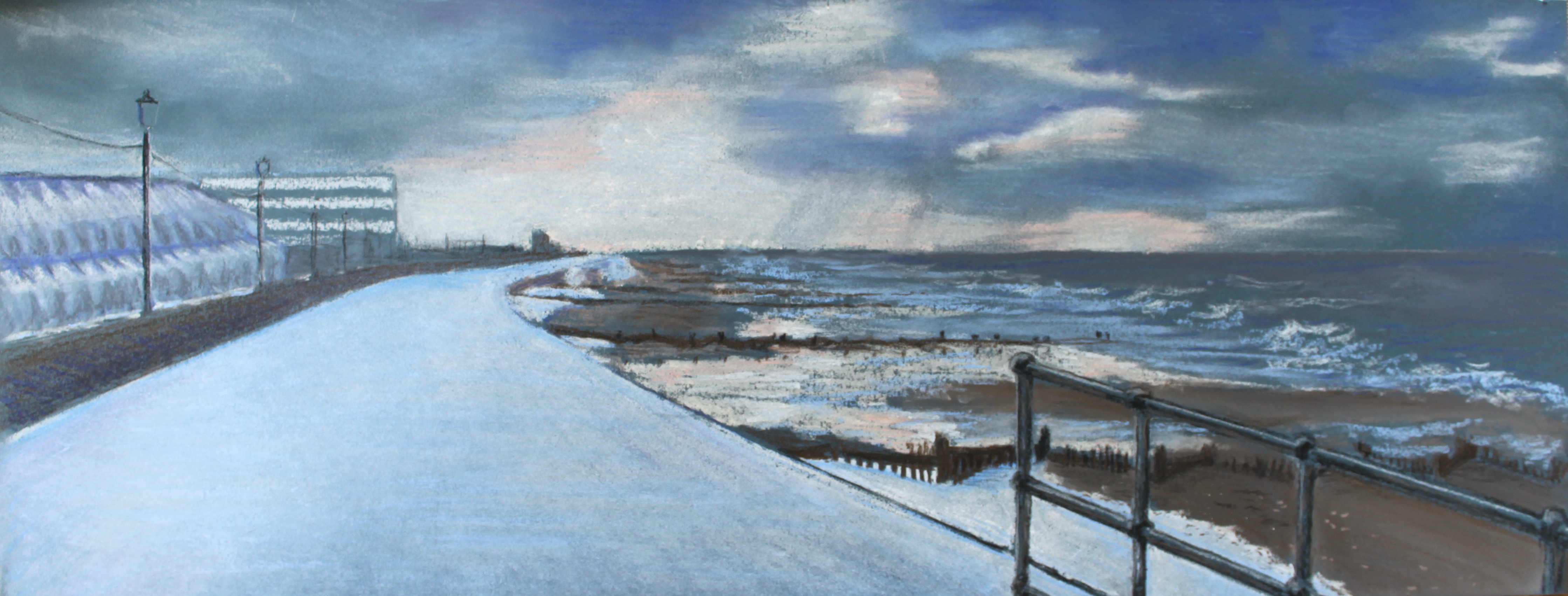 This is my first landscape in pastel. It was quite a challenge, and I’ve been working sporadically on this picture over two days. There are lots of elements of perspective here, always a worry. Then there is the strange, semi-geodesic, 1980s-style building – nightmare. It was built of triangles set at different angles…shudder. Anyone with advice to offer on how to tackle this, please do let me know.
I enjoyed trying out approaches for the sky and sea, but the wet, shiny sand and dull, drier sand were tough. I’d like a cool dark brown/black pastel for my collection, but my local art shop is a bit short on stock at the moment.
As usual, I don’t think I made my picture large enough (9 x 24 ins), so putting the lamp-posts in was a delicate operation. The photograph has lost the subtlety of the colours, especially the blues, which is a shame, but the general idea’s there.
Certainly, this was an interesting project. And that’s what it’s all about…

Wow!!! ❤️
LikeLiked by 1 person
😉
LikeLiked by 1 person
…shortened days with blue snow, brisk winds, ocean swells and complex clouds thrill the spirit, and you’ve brought it all home to me again.
LikeLiked by 1 person
Beautifully poetic! Thank you 🙂
LikeLike
I love the composition of this piece and the juxtaposition between nature and the man-made! I think you did a great job suggesting the details on the building (rather than putting it all in) as it gives the piece more depth. It’s quite cinematic and I feel like I’m standing at the rail taking in the ocean breeze.
LikeLiked by 1 person
I’m so glad you feel it! Thanks for the feedback, it’s always appreciated. 🙂
LikeLike
Wow, I’m amazed this is your first pastel!! This is quite lovely, and puts me right inside the scene (feeling quite chilly!)
LikeLiked by 1 person
Well, to be fair it’s my first landscape in pastel, rather than my first pastel; I’ve been having a go at portraits and flowers in April, but just trying something a bit different to keep things interesting 🙂
LikeLiked by 1 person
Interesting you felt the picture wasn’t big enough. In my part of the world, a 24-inch pastel is considered quite large. On the other hand, you were clearly feeling the great expanse of the scenery. The restrained colour scheme works really well, it gives a chill to the whole place and that sea really does look cold. I’m glad you didn’t put any walking humans in it; I rather prefer the empty desolate sweep of the promenade. If you have problems putting in fine lines with pastel, you’re not the only one. I often use the edge of a hard square pastel, or a Conte stick, or pastel pencil. At the end of it (so to speak), your lamps read like lamps just fine.
Unfortunately I don’t have any ideas for the geodesic building…maybe a few winter trees in front of it might help disguise it and break up the shape; even if there aren’t actually any trees there.
LikeLiked by 1 person
Hi Chris, thank you so much for your great feedback and advice. I’m intrigued that this size is considered quite large – I haven’t got anything to compare it to, as I’m working in a little insulated bubble of my own. But I can see how having a fairly restricted size would be an advantage. I did use the Contes for the lampposts – no option really! 🙂 I think next time I’ll take more notice of the types of buildings and will edit as necessary, the trees are a good tip… 😉
LikeLike